There are colors you can't mix. Not because the theory is wrong, but because the pigments don't behave the way the color wheel says they should. Cadmium orange, for instance. You can get close with a warm red and a yellow, but close isn't the same thing. The cadmium has a density, a weight, a particular way of sitting in light that mixed orange doesn't have.
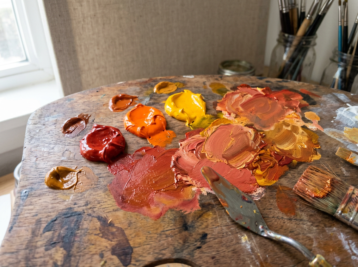
This is one of the things art school doesn't prepare you for. You learn color theory. You learn the wheel. You learn that red and yellow make orange and blue and yellow make green and all of that is true in a theoretical sense. Then you get into the studio and discover that the orange you mixed looks dead next to the cadmium, and the green you mixed looks muddy next to the viridian, and you start to understand that pigments are not colors. They're materials. They have physical properties that color theory doesn't account for.
The Transparency Problem
Part of what makes certain colors unmixable is transparency. Phthalo blue is transparent. Ultramarine is semi-transparent. When you mix them, you get a blue that's neither — something in between that has the properties of neither parent. The painting process and material conversation around this is rich: transparency affects how light moves through a color, how it interacts with what's underneath, how it reads at different distances.
Cadmium colors are opaque. That opacity is part of what makes them unmixable — you can't replicate the way they block light by mixing transparent pigments together. You get a different kind of orange, not the same orange.
The practical implication is that you need to know your pigments, not just your colors. When I'm planning a painting, I think about which colors I'll need that can't be mixed — the cadmiums, the cobalts, the genuine Naples yellow — and I make sure I have them. Everything else I can work with from a limited palette.
What Painters Do Instead
There are a few strategies. One is to simply buy the pigments you need. Cadmium is expensive and slightly toxic, but there's no substitute for certain applications. Another is to use the mixed version and accept that it's a different color — not worse, just different. Sometimes the mixed version is actually more interesting because it has more complexity, more variation in the pigment particles.
The creative community around painting has been moving toward cadmium alternatives — hues that approximate the color without the toxicity or cost. They're better than they used to be. They're not the same. Whether that matters depends on what you're making and why.
I've been using genuine cadmium for the warm passages in a series I'm working on, and cadmium hue for the cooler applications where the difference is less visible. It's a compromise, but it's an informed one. The handmade goods and material culture ethos applies here: know your materials, know their properties, make choices based on what the work actually needs.
The color you can't mix is a useful reminder that painting is a physical practice. The theory is a map. The pigments are the territory. They don't always agree.
More from the studio at Calitoy Muse.