The Failure of the Palette
There's a color in late afternoon light on old brick that I've been trying to mix for three years. Not the brick itself — the light on it. The way it goes almost amber but with something cooler underneath, like the shadow is already in the color before the shadow arrives.

No tube has it. No formula produces it reliably. I get close sometimes and then lose it.
What Mixing Actually Is
Mixing paint is not arithmetic. You can't add yellow to red and reliably get the orange you want, because the yellow you have and the red you have are specific pigments with specific undertones and specific opacity levels, and they interact in ways that depend on the ratio, the medium, the surface, and the light you're working in.
This is why painters develop palettes over years. Not because they're being precious about their materials, but because they're learning a specific language. The same word — "warm red" — means something different in every painter's hand.
I've been reading about how craft traditions pass down this kind of embodied knowledge — the stuff that can't be written in a formula but lives in the hand and the eye. It's a different kind of knowing.
The Undertone Problem
Every pigment has an undertone that only becomes visible in mixture. Cadmium yellow looks warm on its own. Mix it with blue and you get a slightly greenish result. Hansa yellow, which looks similar in the tube, mixes cleaner toward violet. The difference matters enormously when you're trying to hit a specific color.
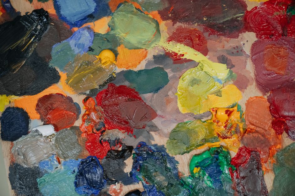
Learning undertones takes years of mixing and looking. There's no shortcut. You have to make the wrong color hundreds of times before you start to understand why it's wrong.
The Color I'm Chasing
The brick-light color. I've gotten close with a base of yellow ochre, a touch of burnt sienna, a very small amount of ultramarine to cool it without greening it, and then a lot of white — but not titanium white, which is too stark. Zinc white, which is more transparent and lets the warmth through.
That's the closest I've gotten. It's still not right. The real color has something in it that I can't isolate — a quality of light that isn't in the pigment at all, that only exists when the painting is working as a whole.
Maybe that's the point. Maybe some colors only exist in context. The fine art community has been talking about this — the way color is relational, not absolute. A color is always a color next to something else.
The Practice of Not Getting There
I've stopped trying to nail the brick-light color and started trying to understand it. The failed attempts are the research. Each wrong mix tells me something about what the color isn't, which is information about what it is.
There's a painting on my wall right now where I got close enough that I can see the color I was after in the painting, even though the paint itself isn't quite it. The painting is doing something the paint alone can't do.
That's the thing about color in painting. You're not mixing pigments. You're mixing light, and light doesn't come in tubes. You have to find it in the relationship between what you put down and what the eye does with it.
The work at brushedpast has been exploring this territory — the gap between material and perception. Worth spending time with if you're thinking about color seriously.